Packaging is an important element of a company's competitive strategy. Without packaging, there is no brand. Today's enterprises must learn brand packaging, so that they can stand out from the sales process and enhance their market competitiveness.
1, whether the packaging style is unique
"Mr. Kline"'s bottle shape adopts the posture of holding arms in both hands, which implies the power of the product. Coca-Cola's exquisite glass bottle is also very unique. It cost US$6 million to buy this patent from Rud engineers and it has been used so far. The overall shape of the bottle is like a skirt. The lines are soft and smooth. The appearance is novel and unique. The bottle does not slide easily when held. The prominent part in the middle of the bottle gives a plump feeling. It looks like the bottle contains more drinks. Foreign companies in product modeling, are all pursuing unique style, to increase the value of products, establish a beautiful image of the product, so that consumers love. Chinese companies may wish to change the "big" and "stupid" styling pursuits of their products. Good products are inseparable from good shapes, and their sizes must have their own characteristics.
2. Whether the package is on the shelf is clear at a glance
Good packaging looks like the effect of a poster on the shelf, at a glance, it makes people enjoy the beauty. In mountainous products, the packaging must maintain visual commonality so that it can jump into the eyes of consumers in numerous products. The consumer's line of sight tends to be triangle-attractive, but it doesn't mean that he likes triangles. A consumer buys goods in front of a shelf, and only a few seconds each time he browses the shelves. Good packaging can capture people's attention. P&G has done a very solid job at this point. Every time a new package is introduced, it is always a small sample of electricity, a simulated shelf, a product on the gold line of the shelf, and a target consumer to test and remember what , Forgot something, and then constantly modify and improve.
3, whether the brand name and logo on the packaging are obvious and prominent
The brand name and logo are submerged in the packaging. The brand pursues “fancy†in circulation, and the brand name and logo are ignored. Even the customer can identify the product for a long time but he still does not know what the brand is. This is a common fault of many domestic products. For example, in Guangdong, there is a kind of moisturizing lozenges called “heart waterâ€. Several people who can use the artistic words to write the brand's beauty can recognize it at a glance. Originally, they wanted people to have a sense of beauty, which was counterproductive and affected the circulation of products. It can be seen that the design of eye-catching logos and brand names, as well as clear fonts, is the key to brand success.
4, the overall appearance of the package feels fresh
The appearance is novel, bizarre, and innovative. Not only can old products rejuvenate youth, but also new products can come to the fore. For example, at the most recent Taipei 2000 Marketing Innovation Best Product Packaging Award, "Spring Breeze Face Paper" (Flower and Bird Series) uses five packaging combinations to form a whole, together forming a bird and flower map. The Chinese flower and bird series are the main design materials. What is most special is that the spring breeze puts the concept of “four-squares continuous painting†on the surface of the paper box for the first time. It has a unique modern style and a fresh sense of packaging. Chinese companies, in the sense of packaging, many products are still "old-fashioned", and need to strengthen innovation and product packaging is full of freshness, the brand will remain fresh, in order to strengthen the brand image and enhance sales.
5. Whether the package appearance shows the same price and value
Once the product packaging shows that the price is equal to the value, the consumer will have the feeling of purchasing a good deal. We have found that consumers often use packaging materials to determine the value of a product. For example, the same product, you put it in glass bottles, cans and paper bags, the value is not the same. Therefore, in the product packaging, the value brought to the consumer must be fully reflected, to consider whether it is equivalent to the psychological price, if the opposite, it must be improved. Otherwise, if the product enters the market, it will definitely lose its advantage in price.
6. Whether the color of the package appearance reflects different content
Reflecting the sensitivity of consumers in terms of color is a part of packaging that cannot be ignored. At present, many domestic companies think that the bright colors of the red and purple will attract people, and they have adopted the most prominent color on the packaging - yellow, resulting in the back-propagation of many products, not worth the candle. The color-focused pattern harmonizes appearance, and reflects the consistent content information, so that people will have the feeling of "seeing and hating late".
7, whether the overall taste of the package is appropriate
It is also important that the taste conveyed by the product packaging is consistent with the needs of the target consumer. Such as chocolate, candy, canned food, realistic picture, it should transmit excellent, fragrant, taste, mouth-watering realm. Another example is whiskey for men's taste, which should convey the unique atmosphere of French noble life and so on. A tasteful package will make you addicted to it.
8, whether the packaging font and advertising echo
The font and the headline or slogan of the advertisement on the packaging are in the same font and color, allowing the consumers to repeat the memory, enhance the recognition and strengthen the memory. Recently, Procter & Gamble launched a new type of shampoo - "Rexa". The font design of the product packaging and POP are all the same typeface and a green leaf to form an integral element, giving people a strong memory. Many domestic brands are very lacking in this respect. Fonts are exchanged in exchange for advertisements. At present, Chinese companies have not received universal attention to the "integration" style. Packaging is the advertisement of a product for life. It is both advertising and style.
9, whether the visual communication of packaging and advertising is the same
The visual and overall planning of packaging and advertising can give consumers a sense of trust. If the identification system and the color scheme between the two cannot be standardized, it will inevitably lead to many conflicts. Visual unification, through the packaging and advertising, and sales incentives, organic use of color composition and deployment, can enhance the brand characteristics, and play a big role in promoting the sales of the product. The large amount of packaging in China and the information conveyed by advertisements do not form an organic overall image, which leads to a decline in the recognition rate of many products consumers, and it is even more difficult to “enjoy registration†for brands. Therefore, we must pay more attention to this.
Source: Guangzhou Assistant Enterprise Planning Co., Ltd. Zhang Bing
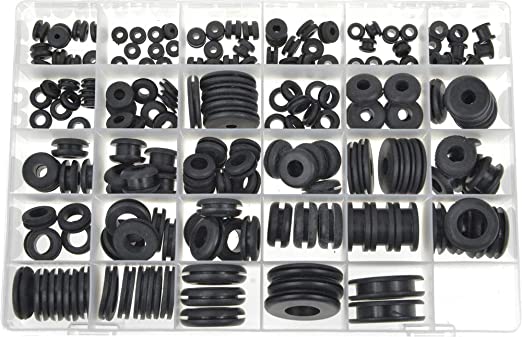
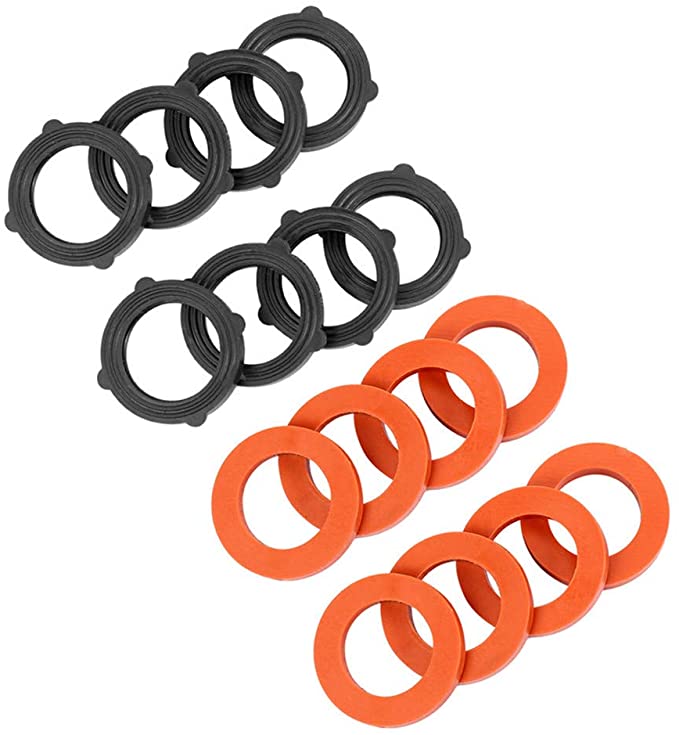
Material is Nitrile (NBR), heat and abrasion resistant Features is wear resistance, rust prevention, high temperature resistance, high pressure YDS Product categories of Silicone Accessories , we are specialized manufacturers from China,Silicone Sealing Ring Silicone Rubber Grommets , Silicone Gaskets ,Silicone Remote Case Cover ,Silicone Game Controller Covers , Silicone Bite Valve ... Our Factory Advantages:
1.Mold workshop and 2D and 3D engineer department2.Solid siliccone compression machine and liquid silicone injection machine
3.Disney and Sedex 4P audit factory
4.ISO 9001,IATF16949,Raw material of FDA LFGB MSDS Certificates
Look forward to your cooperation!


Silicone Sealing Ring,Silicone Replacement Gaskets,Silicone Remote Sleeve Case Skin,Silicone Ring Airlock Grommet
Shenzhen Yindingsheng Technology Co., Ltd , https://www.ydsoemsilicone.com